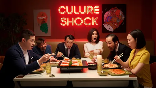
In the intricate dance of global business expansion, the allure of new markets often overshadows the nuanced perils that lie in wait. Companies, armed with successful domestic campaigns and products, frequently march into foreign territories only to find that what worked at home falls painfully flat abroad. This phenomenon, a classic stumble into the localisation trap, is not merely about inaccurate translation but a fundamental misreading of cultural codes, symbols, and consumer psychology. The consequences range from mild embarrassment and campaign failure to severe brand damage and financial loss, serving as a stark reminder that the world is not a monolith.
The journey of a brand across borders is fraught with potential missteps where language is the first, but rarely the last, barrier. A direct translation might convey the dictionary meaning of words but completely miss the cultural context, humor, or connotations that give language its true color and meaning. For instance, a well-known American soft drink giant initially translated its brand name into Chinese characters that phonetically sounded similar but unfortunately meant "bite the wax tadpole." This bizarre and unappetizing imagery was quickly corrected, but not before it became a legendary case study in marketing classrooms worldwide. The error wasn't in the dictionary definition of the words chosen but in a profound lack of cultural and semantic research.
Beyond mere words, the realm of visual design presents an even more treacherous landscape. Colors, imagery, symbols, and gestures are not universal languages; they are deeply cultural constructs. A color that signifies joy and celebration in one culture might represent mourning and death in another. A thumbs-up gesture, a positive affirmation in many Western cultures, is considered a rude and offensive sign in parts of the Middle East and West Africa. Companies that neglect this visual vocabulary do so at their own peril. A prominent American technology company learned this the hard way when it used a map design that controversially depicted borders and territories in a way that was politically sensitive for a large Asian market, sparking public outrage and calls for boycott. The design, seemingly neutral from a Western perspective, was loaded with political meaning in its local context.
Perhaps one of the most sensitive and frequently mishandled areas is that of symbolism and iconography. Religious and historical symbols carry immense weight and must be treated with the utmost respect and understanding. A European fashion house faced global condemnation and had to pull an entire product line after using sacred religious symbols on items of clothing like socks and shoes, which were deemed profoundly disrespectful. The design team's creative intent was likely far from malicious, but the ignorance of the symbol's sacred significance resulted in a public relations disaster and accusations of cultural insensitivity. This underscores that aesthetic appeal must never trump cultural reverence.
Another layer of complexity is added by humor and marketing tone. What is considered clever, witty, or funny in one culture can be confusing, nonsensical, or outright offensive in another. Sarcasm and irony, staples of advertising in some countries, often do not translate well and can be misinterpreted as rudeness or dishonesty. A fast-food chain's attempt at a humorous slogan in a Southeast Asian market backfired when the punchline, which involved a play on words related to a local custom, was perceived as mocking and condescending rather than light-hearted. The campaign was pulled, but the memory of the brand's misjudgment lingered in the public consciousness far longer.
The digital age, while connecting global audiences, has also amplified the risks. User interface (UI) and user experience (UX) design are now critical fronts in the localisation battle. The direction of reading—left to right versus right to left or top to bottom—fundamentally changes how a website or application should be designed. Icons that are intuitive in one region may be completely alien in another. A simple envelope icon for mail might be universally recognized, but a icon representing a shopping cart might not resonate in cultures where outdoor markets or different shopping rituals are the norm. Failing to adapt the UI/UX can lead to a frustrating and alienating experience for users, directly impacting engagement and sales.
So, how can businesses navigate this minefield? The solution lies in moving beyond simple translation to embrace deep cultural localisation. This involves investing in native cultural consultants and local experts from the target market at every stage of the process—from initial concept development and copywriting to visual design and final review. It requires a mindset of humility and a commitment to understanding the market from the inside out, not from the outside in. Rigorous testing with focus groups within the target culture is non-negotiable; it can uncover unintended interpretations and cultural faux pas before a product or campaign is launched. It's a process that demands time, budget, and most importantly, respect for the audience.
The localisation trap is a powerful teacher. The companies that succeed on the global stage are not those who assume their domestic blueprint will work everywhere. They are the ones who listen, learn, and adapt. They understand that true localisation is not an expense but a vital investment in building trust, relevance, and lasting relationships with a new audience. In a world that is increasingly connected yet beautifully diverse, cultural intelligence is no longer a nice-to-have; it is the ultimate competitive advantage.

By /Aug 26, 2025

By /Aug 26, 2025

By /Aug 26, 2025

By /Aug 26, 2025
By /Aug 26, 2025

By /Aug 26, 2025

By /Aug 26, 2025

By /Aug 26, 2025

By /Aug 26, 2025

By /Aug 26, 2025

By /Aug 26, 2025

By /Aug 26, 2025

By /Aug 26, 2025

By /Aug 26, 2025

By /Aug 26, 2025

By /Aug 26, 2025

By /Aug 26, 2025
By /Aug 26, 2025
By /Aug 26, 2025

By /Aug 26, 2025